
Why do some communities have ten times the homelessness of others?
It turns out you can largely see it in their housing markets. The Index turns that into one number — a 0–100 read on how much pressure a county's housing market puts on lower-income households, for nearly every county in the country.
One number tells you how much pressure your county is under.
A 83 says Skagit's housing market puts high structural pressure on lower-income households. Open the score and it breaks into the five signals behind it — so you see not just how much distress, but what's driving it.
The strongest single signal is the share of households stretched past the affordability line. Homelessness lives in the lower-income tail, and a median hides it.
One comparable score, for nearly every U.S. county.
The Index is built from the housing measures that best track where homelessness concentrates — how high rents sit relative to income, how widely households cross the affordability line, and how tight rental supply is. It reads structural pressure, not a single-night count.
0-100
A single, comparable score
Low means lower pressure on lower-income households; high means more. The same scale everywhere.
~3,100
Counties, nationwide
The same finding, carried down from the metro scale to nearly every county in the country.
5
Signals, three dimensions
Availability, affordability, and cost burden — the three dimensions behind every score
The same score puts your county on a shared map.
Because every county is scored the same way, one number does double duty. Rank it within your state — Skagit sits #4 of 39 Washington counties. Or find its sister counties: places with the closest housing-pressure profile anywhere in the country, however different they look on a map.
That's what turns a local reading into a national conversation — and lets a planner in Washington learn from one in Colorado.
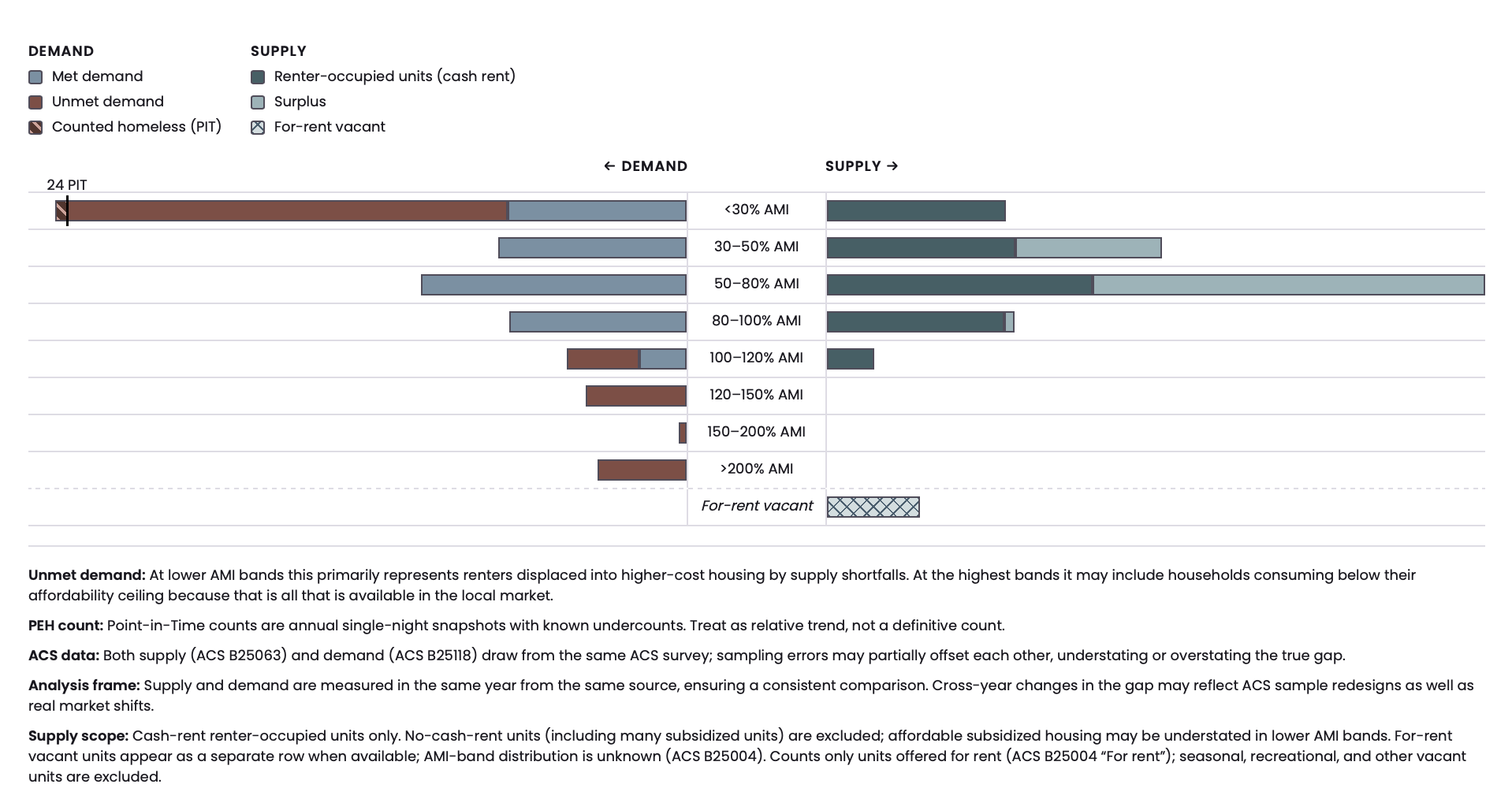
The housing gap isn't spread evenly — it lands on the most vulnerable.
The Renter Housing Gap sits alongside the Index rather than inside it. It breaks demand and supply apart by income band, so you can see where the shortfall actually bites. Below roughly 50% of area median income, demand far outruns the homes that exist. Above 100% AMI, supply runs to surplus — those households barely feel the distress at all.
A number you can check, reproduce, and take to the table.
Verifiable evidence
Every figure is paired with the public source data it came from, locked to a fixed baseline.
Reproducible end to end
The whole pipeline, from raw data to score, can be rerun and audited by anyone.
No policy preference
Equally useful to developers, nonprofits, community land trusts, planners, and treatment advocates.
Research
The research behind the index
A deep dive into the construction, validation, and findings that drove the design — from raw inputs to final score.